A strong release, product or business can still get ignored when the logo feels disposable, the posts look unrelated and every new graphic starts from zero.
I close that gap with a visual system people can recognize, trust and remember.
For artists / Bands · Rappers · Musicians · Labels
Your release needs a visual identity.
Cover art, release posts and merch should feel like they belong to the same artist. TXBMM builds artist identities, album and single artwork, release visuals and apparel graphics around one direction.
Identity systems · Album + single art · Social rollout assets · Merch graphics
See the Suburban Sermon release concept and the Obsidian Cult Records merch capsule.
For brands / Founder-led · Culture-driven businesses
Your brand needs more than a one-off logo.
When the logo, posts and product graphics feel unrelated, every new piece starts from zero. TXBMM builds identities and campaign creative that carry a clear direction across those pieces.
Identity, release and merch work, starting with the design aim. Client work and concept directions are labeled below.
01
Identity case study · Podcast / radio
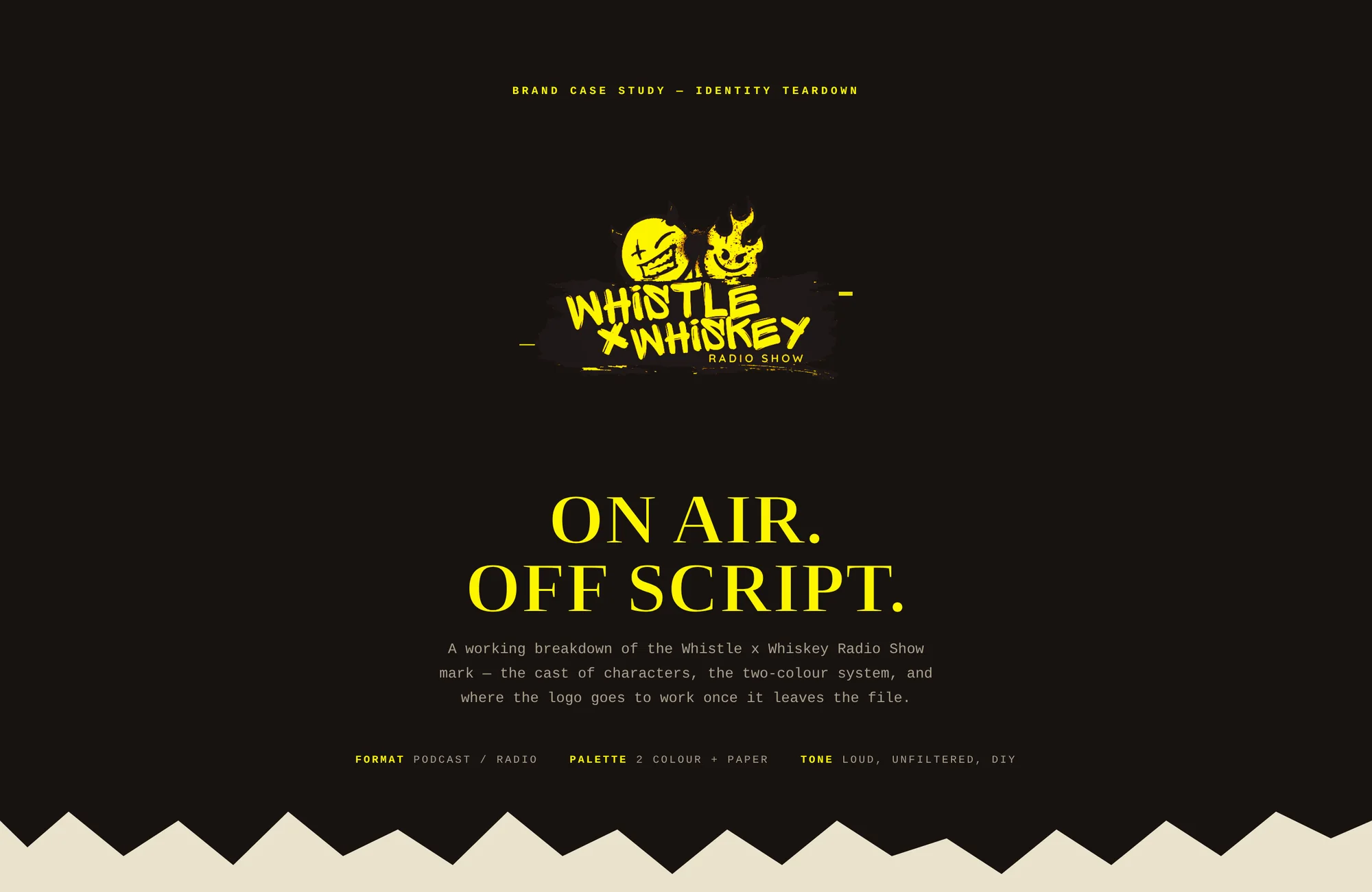
Whistle × Whiskey
Design aim
Give a loud, unfiltered show one recognizable on-air mark.
Direction
Character-led, high contrast and deliberately off-script.
What was built
Primary mark, cast of characters, two-colour palette and deployment logic.
Intended uses
Broadcast graphics, social promotion, merch and live applications.
A working identity breakdown that turns a loud, unfiltered show into one recognizable on-air mark.
02
Phase-one identity · Client work
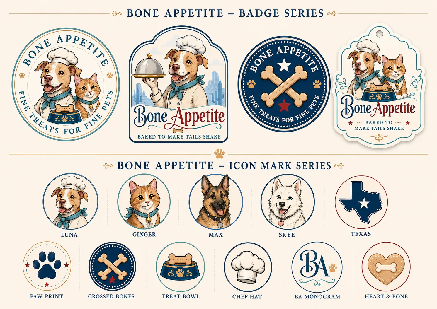
Bone Appetite
Design aim
Give a Texas pet-treat brand warmth, recognition and room to grow.
Direction
Boutique bakery warmth balanced with bold, friendly character.
What was built
Master mark, badge series, icon family, typography and tagline.
Applications / direction
Labels, product families, social graphics and retail touchpoints.
A mascot-led identity system built to give a Texas pet-treat brand warmth, recognition and room to grow.
03
Identity exploration · Concept directions
New Mexico 12 Volt
Design aim
Explore how power, motion and regional cues can become a fast-reading brand mark.
Direction
Speed, electrical energy and New Mexico geometry without a generic bolt.
What was built
Four identity routes, symbol explorations, wordmark variations and high-contrast palette options.
Intended uses
Vehicle graphics, workwear, signage and digital use.
Four identity routes testing how power, motion and regional cues can become a fast-reading brand mark.
04
Release artwork · Concept direction
Suburban Sermon
Design aim
Build a release world with a title treatment that can carry the campaign.
Direction
Red, navy and bone with worn flag texture and suburban-night tension.
What was built
Hero artwork, alternate cover direction and custom title treatment.
Applications / direction
Cover art, announcements, social cuts and campaign extensions.
A release world built from distressed Americana, empty streets and a title treatment strong enough to carry the campaign.
05
Campaign + merch · Client work
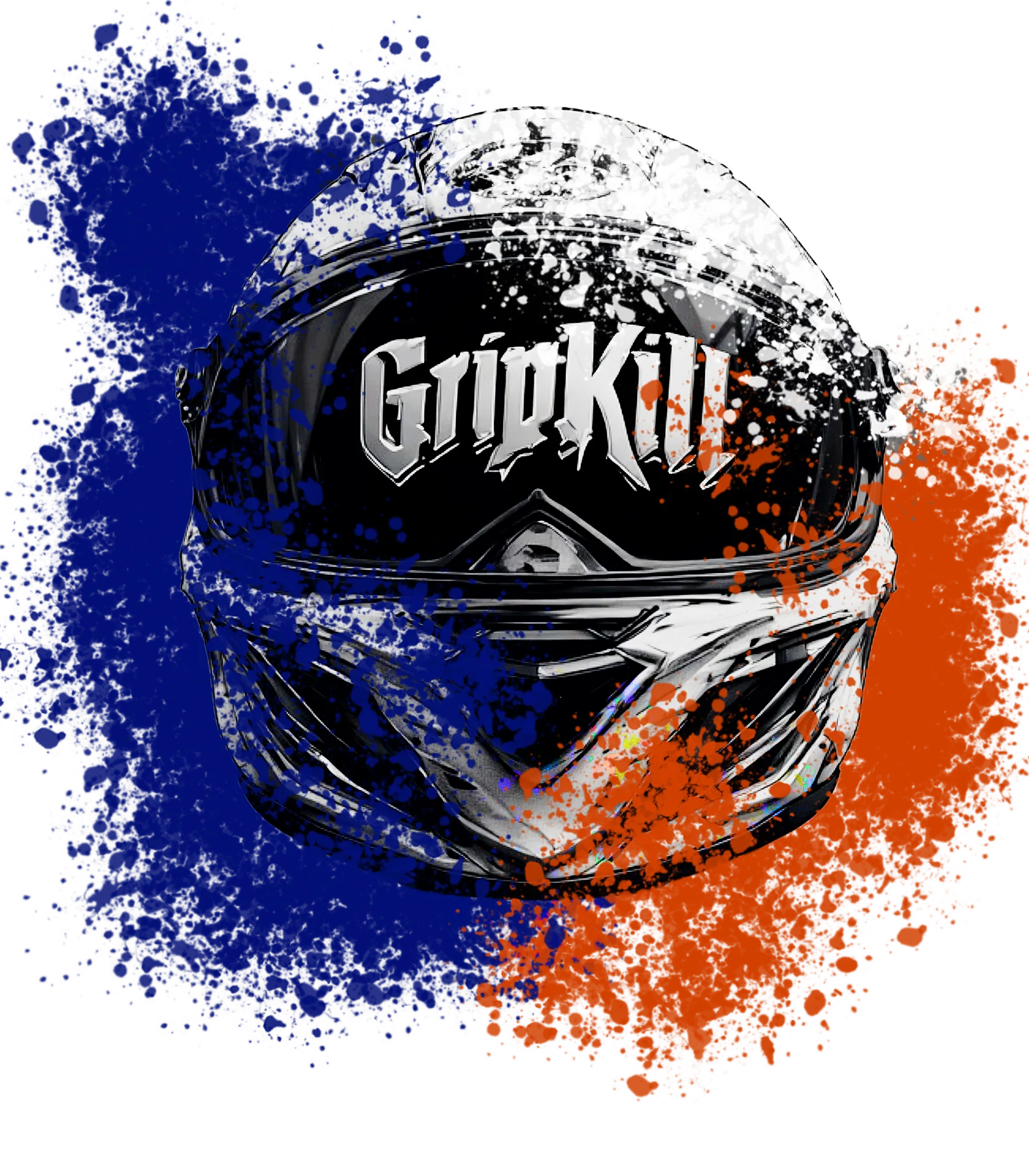
Gripkill Supply Co.
Design aim
Carry a motorcycle-focused visual direction across promotion and product.
Direction
Gothic lettering, high-speed imagery and a blue/orange signal palette.
What was built
Promotional cover direction and a standalone helmet graphic.
Applications / direction
Social promotion, product graphics and future campaign cuts.
A motorcycle-focused visual direction translated across promotion and product without losing speed or impact.
06
Merch capsule · Client work
Obsidian Cult Records
Design aim
Give a record label multiple apparel directions while keeping its name consistent.
Direction
Small chest marks, oversized backs and black/white garment contrast.
What was built
Typographic marks, character graphics and cold/fire artwork variants.
Applications / direction
A multi-route shirt capsule with deliberate front and back placement.
A front-and-back apparel system that gives the label multiple visual lanes without losing the name.
03 / What I build
What the work can include.
Identity, release and merch work for both buyer paths.
01
Identity Systems
Recognizable visual foundations for brands that need more than a one-off logo.
Logos + wordmarks · Type + color · Mascots · Supporting marks · Brand standards
02
Release & Campaign Systems
Connected visuals for a release, launch, event or promotion that has to hold together across every touchpoint.
Album + single art · Posters · Social rollout assets · Launch visuals · Campaign direction
03
Merch & Apparel Graphics
Wearable artwork and product collections built around the identity instead of pasted onto it.
Apparel graphics · Drop systems · Placements · Supporting marks · Production-ready art
Need one strong asset first? Single-release artwork and standalone merch graphics are available when the project has a clear purpose—and can expand into a connected system later.
Built for
People already moving.
Musicians with releases. Apparel brands with products. Independent businesses with proof, momentum and a point of view.
Not built for
Cheap-logo roulette.
No unpaid samples. No “make it pop” scavenger hunts. No pretending a random graphic is a brand system.
04 / Process
Clear enough to move. Flexible enough to make something original.
01
Find the real problem
We define what is changing, what is getting lost and what the new work has to accomplish.
02
Build the direction
You see a clear visual direction before the idea expands into every deliverable.
03
Make the system
The selected direction becomes connected, usable assets instead of unrelated files.
04
Release it clean
Final work is organized for real use, with direct communication and no agency telephone game.
TEXASTXBMM
Different by design. Defiant by nature.
05 / The studio
One creative director. No middlemen. No diluted decisions.
Texas Blood Money Media is an independent creative studio founded by Seth Ramirez in San Angelo, Texas. The studio builds bold visual identities, release campaigns and merch systems for musicians, apparel brands and culture-driven businesses.
The work combines strategic brand thinking with music, underground art, apparel and outsider culture—creating visuals that can move consistently across digital, print, products, promotion and merchandise.
Seth Ramirez Founder / Creative Director
06 / Start something
Tell me what is changing, launching or falling behind.
You do not need a perfect brief. Send the project, the deadline and what currently feels disconnected. I’ll tell you whether I’m the right fit and what the next move should be.